Matter Of

Matter Of: Juliet Records

The communications manual for Juliet Records serves both as a progress diary and a set of branding guidelines.

Matter Of: Juliet Records

The Display weight of Juliet Grotesk in use.

The website combines all the central elements of the identity.

Matter Of: Juliet Records

Juliet Grotesk comes in ten weights.

Social Media assets for releases of the label.

Matter Of: Juliet Records

Juliet Records Studio Material.

Social Media assets and type animation for Juliet Picks.

Juliet Records

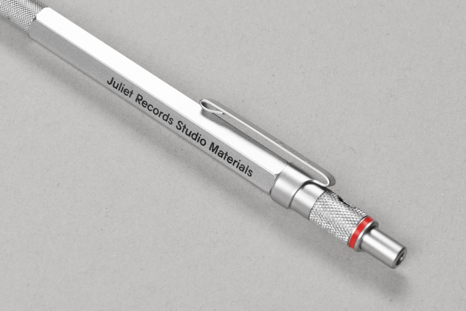
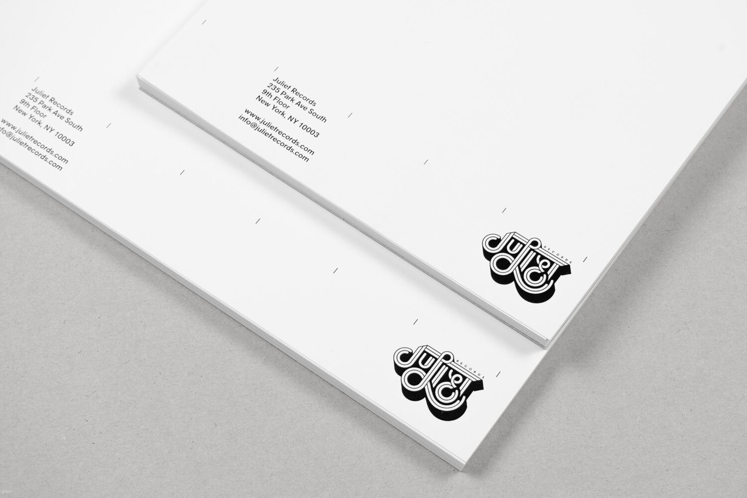
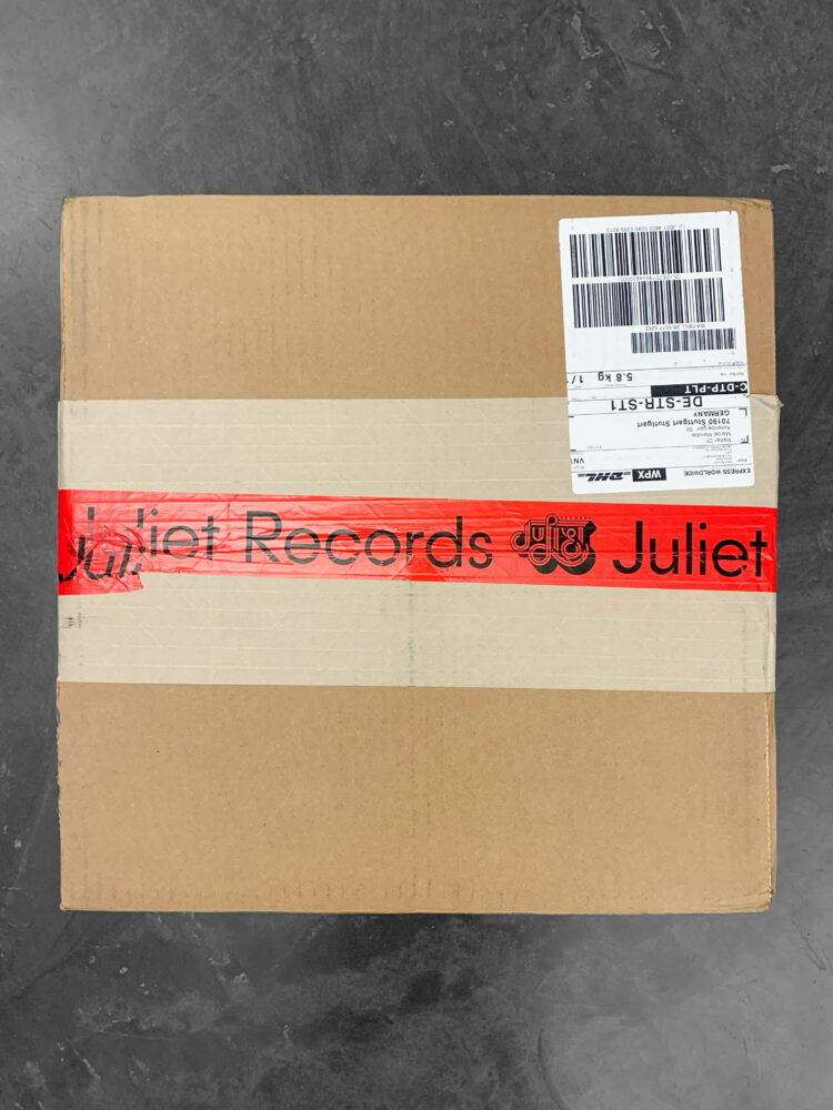
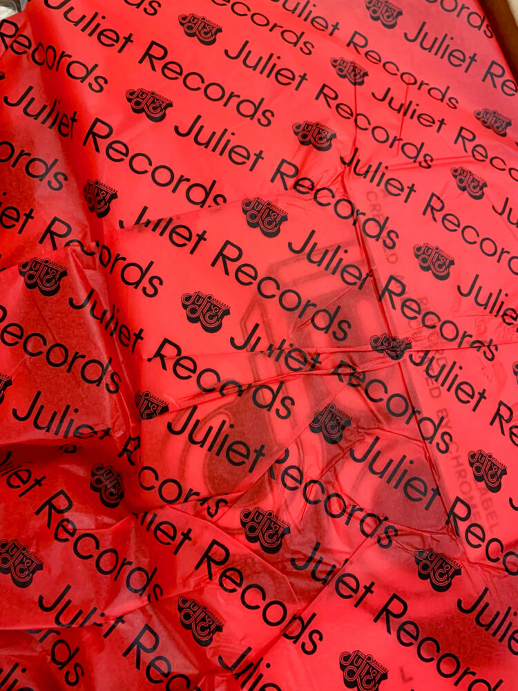
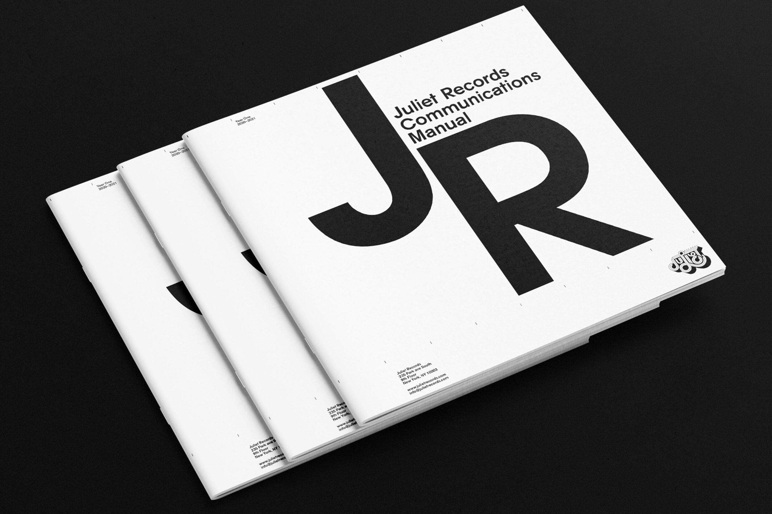
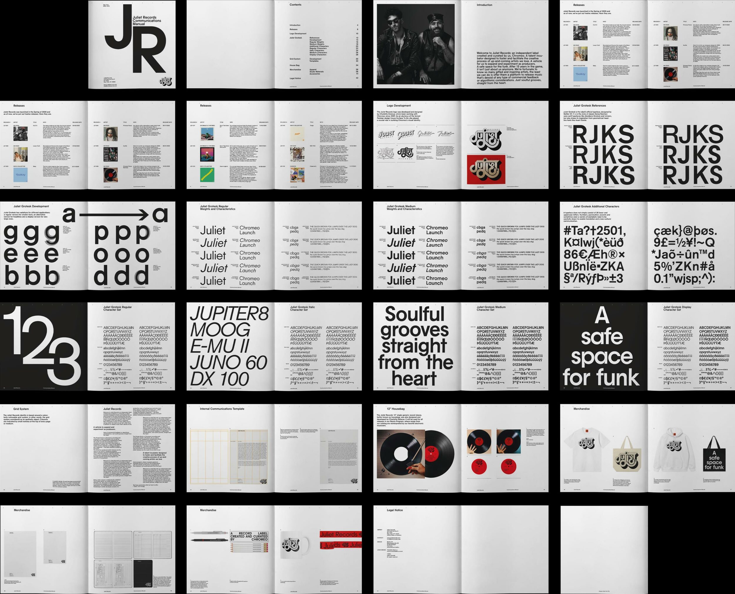
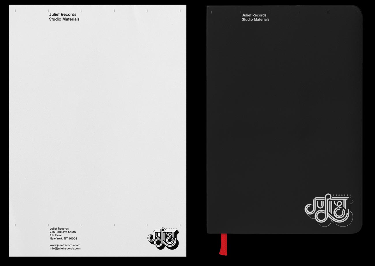
Identity, website and various applications for Juliet Records, an independent label created and curated by Chromeo. The identity is a merge of traditional Swiss/German grid and typography-based design and a retro funk feeling.


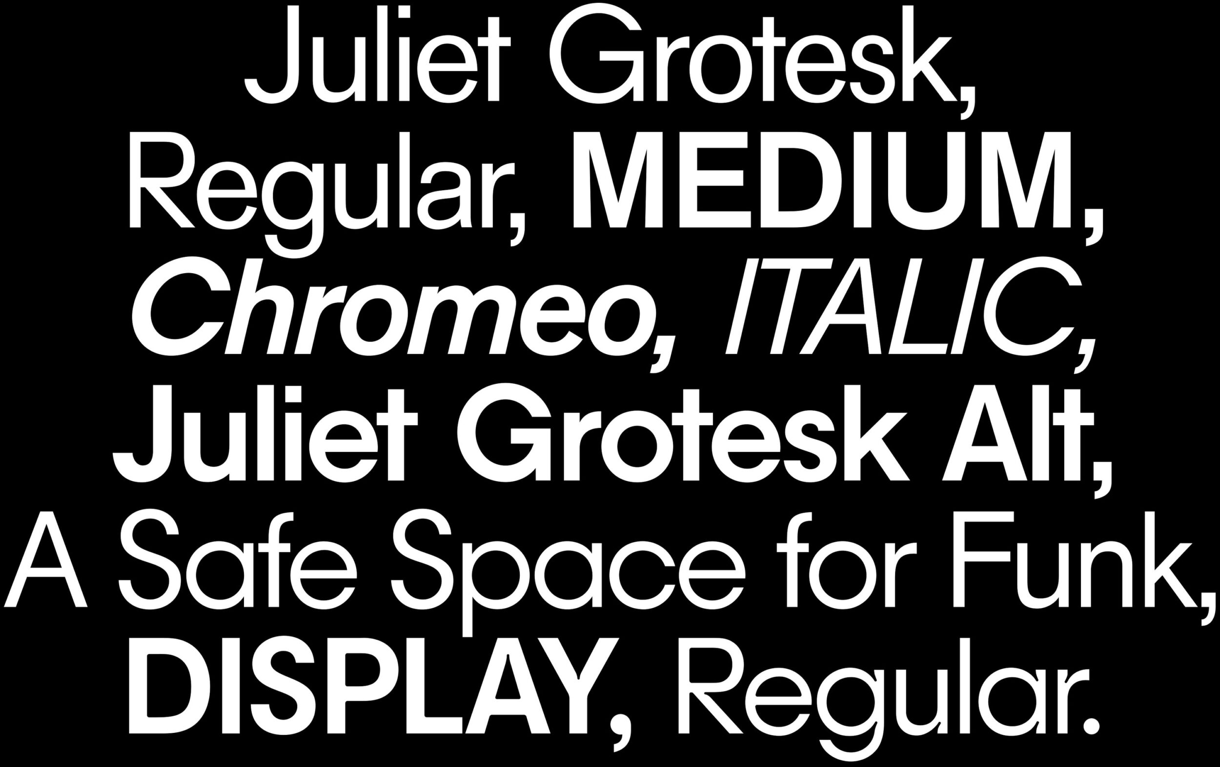
A central part of the identity is a custom typeface called Juliet Grotesk. It is in the style of classic sans-serif typefaces like Akzidenz-Grotesk and Univers, but also draws inspiration from geometrical headline fonts like Avant Garde.

The typeface comes in two versions, a regular grotesque and an alternative, more geometric style.

The Display weight of Juliet Grotesk is used for larger titles and headlines.

The merchandise for the label consits of a set of Studio Materials like notebooks and mechanical pencils.

Details of the Studio Materials.

“A 1950s corporation is the opposite of a funk label, but that contrast is what makes it interesting to us.”–Dave 1 of Chromeo

Animated version of the final Juliet Records logo, developed and designed by Charlotte Delarue.

Early drafts of the logo by Charlotte Delarue.

Packaging Material used for the merchandise.